
Showing posts with label Guest Review. Show all posts
Showing posts with label Guest Review. Show all posts
Wednesday, February 21, 2018


Tuesday, May 30, 2017
Guest Review: Ignatius New Testament and Psalms RSV-2CE
Thank you to Chris for this guest review.


Because I travel a lot for work, I often rely on the Catholic
Study Bible app from Ignatius Press and the Augustine Institute.
Phone batteries, however, drain fast. So when the Holy Father recommended in
March that Catholics should put down their phones, talk to each other more, and
carry a pocket New Testament to read, I began
looking for one of my own.
The Ignatius New Testament and Psalms (RSV-2CE)
has a lot going for it, not the least of which is its size. Here you can see it
alongside the standard Ignatius Bible and Ignatius Study Bible New Testament
for comparison. It’s much smaller, and thus perfectly suited for a travel
edition.
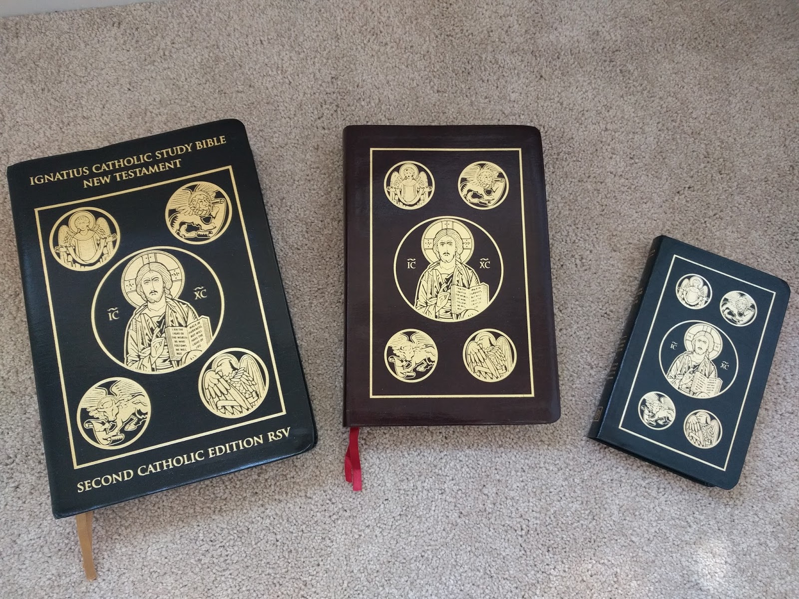
At basically 4” x 6” it’s extremely easy to stuff in the front
pouch of my work satchel, along with the small moleskine journal I use to keep
notes and draft poetry.

It’s also a match in size for Christian Prayer and the Liturgy
of the Hours, so if you travel with that, it’s a good companion.

Obviously, reducing the size requires a different typesetting
than the standard edition. The 9/10 font size used in this little volume is
still easy to read, while maximizing space even in a dual-column layout.
Subsection titles stand out from the text of scripture in an easy-to-read sans
serif font.

It has some additional features that I like, including two
ribbon markers (at least in the leather edition), a preface from Albert
Cardinal Meyer, Archbishop of Chicago, and introductions to both the New
Testament and the Psalms. It even reprints the original 1965 letter from
Richard Cardinal Cushing, Archbishop of Boston to the Catholic Biblical
Association of Great Britain who produced the original RSV Catholic
Edition.

I can understand not including a copy of Dei Verbum in the interest of keeping the
volume compact, but I really would have appreciated a lectionary calendar of
daily mass readings. Sadly, in order to maximize the amount of scripture on
each page, the explanatory notes are printed in an appendix rather than inline
with the text, similar to the way Oxford handles them in its RSV-CE compact
volume.

The most distinguishing feature of Ignatius’ RSV Second
Catholic Edition is the way it addresses the criticisms of the Catholic NRSV by
simply removing archaic verbs and pronouns from the original Catholic RSV and
adjusting some vocabulary for liturgical considerations. It’s in a volume like
this where those characteristics stand out the most: it’s in the Psalms where
the original RSV maintained the archaic addresses to God, and the New Testament
is where a lot of the changes required by Liturgiam authenticam occur. Even more than a
full Bible, this New Testament and Psalms has the feel of a Catholic ESV.
For lack of a better description, it’s actually a rugged,
“manly” little volume, rather like the one used on the Catholic Gentleman blog to model their rugged rosaries.
It’s the Catholic answer to those little NT and Psalms the Gideons used to pass
out in front of my high school. I recommend it highly.
Christopher Buckley
holds an M.A. in Religion from the Claremont School of Theology. He began as a
United Methodist and passed through the Episcopal Church before being confirmed
into the Catholic Church as an adult. He lives and works in Seattle with his
wife and two children, and blogs occasionally at StoryWiseGuy.com. Connect with him on Twitter,
Google+, Pinterest, Flickr, and LinkedIn.
Friday, March 10, 2017
Guest Review: Catholic Children's Bible by SMP
Catholic Children’s
Bible by St. Mary’s Press
Reviewed by Chris Buckley
Glorious. It’s simply glorious. If you have a child, and you
want them to know Scripture and not just Bible stories, the Catholic Children’s Bible from St. Mary’s Press
is the only Bible to consider. Literally. It may well be the only full-text Bible formatted
specifically to build Biblical literacy and Catholic faith in children.
It’s clearly designed by people who not only value the Bible as
scripture, but are also skilled curriculum designers for the learning styles of
children.
For one thing, it’s huge. At 7 x 10 inches and 2000 pages, it
has the heft of those old Golden Books Children’s Bibles you may remember from
the 1960s and 1970s. Not an asset for most readers of this blog, but trust me:
it makes for a lasting place on a child’s bedroom bookshelf.

For another, it uses layout, font size, illustration, and color
prompts to make it as easy as possible for new Bible readers to navigate. In my last post, I called for solid navigation
aids. This Bible has them in spades, better than any I’ve ever encountered.
It’s practically an orienteering course in Bible reference. It introduces the
layout of the individual books in their various textual groupings with a
color-coded bookshelf graphic. That color-coding carries through into the
borders of the pages, and the section headings of the individual books. A child
can easily find - and internalize the internal order of - the books of the
Bible this way until it becomes automatic. Lavish edge illustrations surround
the text on nearly every page, making it a colorful “page-turner” that even
young kids will flip through like a big lap-sized picture book, whether they
are readers or not.


The publishers didn’t ignore children who read, though. They
have wisely selected the approved Catholic edition of the Good News Translation
(formerly, Today’s English Version, second edition). If you remember the Good
News Bible of the 1970s, you know what to expect, but you may not be familiar
with the improved, revised edition of 1992, formally approved for Catholic use in 1993. Though
still a “thought-for-thought” translation using syntax and vocabulary for about
a fourth-grade reading level, the new GNT is to the old Good News Bible what
the NLT is to the old Living Bible. Today, it’s a proper translation from the
original texts, no longer a paraphrase of a standard English text, hence the
imprimatur. I have far more confidence in it as a proper book of scripture for
beginning reader. (By comparison, the publisher’s Catholic Youth Bible comes in both NRSV-CE and
NABRE varieties.) If you’re going to create a Bible for kids out of an approved
Catholic translation in English, this is the text to use.
But it’s what they do with
the text that makes this Bible so wonderful. Instead of the traditional Annie
Vallotton line drawing that typically accompany the Good News Translation, the
publisher has introduced its own full-color illustrations that tie into the
learning aids. In mid-flow of the scriptural text itself, the publisher
introduces 125 Bible stories told in two-page illustrated spreads. Each spread
follows the same format: the scripture text from the page before continues
directly onto the left hand page so that the Bible passage itself becomes the
“story,” surrounded by illustrations and definitions of any challenging
vocabulary. The right-hand side of the spread employs a standard format for
every story (also adopted for older readers in the Catholic Youth Bible):
●
Understand it - a brief exegesis of the passage for
children
●
Live it - A devotional tip for how to put the teaching
of that passage into practice
● Tell
it - A simple storyboard an adult can use as a prompt for the child to retell
(and thus internalize) the story in their own words

Then the Bible text continues uninterrupted on the next page. By making the scripture itself into the stories, and by including so many passages, this book is now the best of both worlds: a full Bible that can also function as a “big book of Bible stories” most Catholics are used to. With 125 selections interspersed throughout scripture, using it as a bedtime storybook and reading one story a night, a parent and child could literally work through the entire canon of scripture together in about 17 weeks. Simply amazing.
It concludes with colorful, yet simplified Biblical aids using
photographs and illustrations in place of the typical essays and maps an adult
study Bible might have. It has a brief section full of catholic Prayers,
instruction on the rosary, and a final page of “Bible Passages for Special
Times” to help children find consoling passages for specific life events or
challenges. I wouldn’t have thought it possible, but this is a functioning
“Study Bible” for children, covering the same spread of textual and dogmatic
instruction as something like the Ignatius Catholic Study Bible. Along with the
companion Catholic Children’s Prayer Book, it’s a
terrific resource. This isn’t the Bible to give at first communion. Rather,
it’s the Bible to give in kindergarten and read together on their journey
toward the sacraments.
Monday, October 17, 2016
Guest Review: Jerusalem Bible (Salvador Dali Illustrated Edition)
A special thank you to long time reader of this blog Rolf for this review of the Dali Jerusalem Bible.


The Jerusalem Bible (Salvador Dali illustrated) edition is a
Bible that I had been 'watching' on ebay for a very long time. It was published
in 1970, but it makes frequent appearances on ebay usually for $150.+ I was
able to obtain this copy at auction in new like condition for about $65.
shipped.
This is a huge Bible: 12 x 8 1/2 x 2 3/4 inches and it weighs a little less than a smart car! The Bible is bound in red (bonded, genuine or faux?) padded leather over boards. I am not sure, I have read that it is leather and faux leather but the slightly padded hardcover looks nice and works well with this big Bible!
The Salvador Dali illustrations are all full page and there are 32 of them. Dali's illustrations can be strange, but they always make you think when you see them.
The real reason I wanted this Bible was for a chance to read a large print Jerusalem Bible! I have three other Jerusalem Bibles, two with size 9 print and a compact with size 7 print. When I found out that this Bible had size 11 (well spaced) single column print, I had to get one! The paper is thick and bleed through is very well controlled! The illustrations are on much heavier paper and are quality prints. It comes with two very nice and wide red ribbon markers.
This is a table top/ lap type Bible, but it is a great reading/ devotional Bible (with minimal notes/reference numbers at bottom of the page)! Is it worth $150.? In excellent condition I think it is! With high end Bibles now selling for $250-$300.+ and bonded leather study bibles nearing the $100. mark, I would say yes! But maybe with a little looking around it could be found cheaper!
This is a huge Bible: 12 x 8 1/2 x 2 3/4 inches and it weighs a little less than a smart car! The Bible is bound in red (bonded, genuine or faux?) padded leather over boards. I am not sure, I have read that it is leather and faux leather but the slightly padded hardcover looks nice and works well with this big Bible!
The Salvador Dali illustrations are all full page and there are 32 of them. Dali's illustrations can be strange, but they always make you think when you see them.
The real reason I wanted this Bible was for a chance to read a large print Jerusalem Bible! I have three other Jerusalem Bibles, two with size 9 print and a compact with size 7 print. When I found out that this Bible had size 11 (well spaced) single column print, I had to get one! The paper is thick and bleed through is very well controlled! The illustrations are on much heavier paper and are quality prints. It comes with two very nice and wide red ribbon markers.
This is a table top/ lap type Bible, but it is a great reading/ devotional Bible (with minimal notes/reference numbers at bottom of the page)! Is it worth $150.? In excellent condition I think it is! With high end Bibles now selling for $250-$300.+ and bonded leather study bibles nearing the $100. mark, I would say yes! But maybe with a little looking around it could be found cheaper!


Monday, April 25, 2016
Guest Review: The Catholic Study Bible NABRE (3rd Edition)

I would like to thank Steven for giving me permission to post his review of the Catholic Study Bible. Steven is Mormon, which makes this review very unique.
Title: The Catholic Study Bible, Third Edition
Editors: Donald Senior, John Collins, and Mary Ann Getty
Publisher: Oxford University Press
Genre: Bible/Study Bible/New American Bible Revised Edition
Year Published: 2016
Number of Pages: 2560
Binding: Hardcover
Size: 6 1/4 X 9
ISBN10: 0199362777
ISBN13: 978-0199362776
Price: $49.99
Reviewed by Steven Ray Montgomery for the Association for Mormon Letters
I try to meet people on common ground, and search for ways that we can agree on, rather than differ.
So, while I, as an active Latter-day Saint, have obvious and glaring disagreements with Paganism and the Pagan origins of Easter for example, at least I agree with them on the aspects of rebirth, new life, preservation of life, that accompany the Spring of the year. And I can celebrate those aspects in spite of other doctrinal differences.
I'm trying to treat the recently published Catholic Study Bible, Third Edition, in the same manner. First, the translation itself. The NAB (New American Bible) was a decades long work of 100 "scholars, including translators, editors, and a subcommittee of Catholic bishops who provided extensive review of the biblical text over" that period. A revision of the NAB then took place. The NABRE (New American Bible Revised Edition) is the first major amendment to the New American Bible translation since 1991. It takes into account recent archaeological and textual discoveries.
As to the common ground, mere belief in the Bible is an area of agreement between Catholics and Mormons. And the Catholic Church has been actively promoting Bible readership among its members, admitting that "biblical focus was lost" when "philosophical analysis" overwhelmed "biblical foundations."
But the Catholic Church is seeking to remedy that, this Catholic Study Bible being one of the tools to restore the balance. And as contained in the Reading Guide, "the purpose of this newly revised and updated Catholic Study Bible is to enable the reader to read the scriptures with new understanding and depth." The world sorely needs that understanding: Catholics, Mormons, the entire Protestant world, etc.
The Bible itself is a very handsome one. It comes with an almost six hundred page reading guide, which I found to be an excellent guide and introduction to the Bible as a whole, as well as each book contained within the Bible. The Reading Guide "leads the reader through the scriptures" and gives an extensive "treatment of the biblical background, . . . history and archaeology." One thing I especially liked was the interconnection between the text of the Bible and the relevant pages of the Reading Guide. I also found myself mostly agreeing with the length, width, and breadth of the Biblical scholarship therein. Some differences over doctrine? Yes, but many areas of agreement.
The Bible is published by Oxford University Press and I found it to be a great resource, with study notes, essays on various topics, informative sidebars, etc. There is also a 15 page glossary of special terms, thirty-two full-color Oxford Bible maps with an extensive place-name index and a 100 page concise concordance. The maps, glossary, and place-name index are fabulous--I love to know where events take place in the Bible, their meaning, and their relationship to other places. These features alone make the Bible well worth the price. But there is also a table of weights and measures, an index to the reading guides, and, important to Catholics but I found it meaningful as well, a full listing of lectionary readings for Sundays, Holy days, and weekdays.
Incorporated into the text are 52 in-text maps and 18 side-bar essays and charts. I found these to be quite helpful.
One great feature of Catholic Study Bibles in general, and this one in particular, is the inclusion of apocryphal works missing in the Protestant canon such as the books of Baruch, Ben Sira, Tobit, and so forth, as well as extensive notes and commentary for these books.
In conclusion, this is an excellent study Bible. Any serious student of the Bible would be pleased to own one, whether Catholic, Protestant, or Mormon. This Mormon is pleased to own one.
Monday, December 14, 2015
Guest Review: SPCK NRSV-CE
Thank you to my friend Owen for this review. I am so excited that this edition is available, since it is sewn NRSV-CE with cross-references. This may be a possibility for rebinding, or perhaps a publisher like Allan's might consider turning it into something even better.


This is a review of the Catholic Edition of the 2015 NRSV by SPCK, Society Promoting Christian Knowledge, "since 1698" - who knew? Not me.
Overall impression: a very good daily reader in a quality economy edition with bonuses; sewn, ribbons, and cross reference system all in a comfortable size that is easy to hold and not too heavy to take-with.

Things I think are self evident from the photos: ghosting (minimal), kerning & leading (both excellent), binding (again, sewn), margins, page settings.
Yes, Anglicized. Amen!
Publication page details: published in the UK / printed and bound in India, "produced on paper from sustainable resources" / carries the 1991 Imprimatur of the National Conference of Catholic Bishops, Washington (as differentiated from the USCCB body) and of the Canadian Conference of Catholic Bishops in the same year. Curiously, being produced in the UK there is no Imprimatur from other English language countries, like um, the UK.
Size = a good "personal" bible size / 14.8 x 3.5 x 24.5 cm / 5.8 x 1.3 x 8.6 inches

Weight = I haven't put it on a scale but it is very comfortable in the hand, no problem reading it in hand or carting it about.
Smyth sewn: opens beautifully flat from the word go. This one will stand up to extended use. *If* it had rounded page edges it would make a nice volume to have rebound.
Notes = none beyond translator notes. No concordance. No book introductions or other explanatory notes. With the exception of Esther
Ribbons = yes! Of pretty average quality, may fray (I have tips on how to prevent that if you like) but hey, there are two ribbons(!) and ribbons of any kind in an economy bible is a solid.
Paper = smooth, typical HC thickness, note-takers will find it takes pencil and pen well with minimal ghosting on the reverse side.

Font setting = style and size are not mentioned (nor found anywhere online by me to date). I'm going guess 10 for the main text, footnotes 8-ish and references 6 and 7.5 in a very clean, readable setting even for mid-life eyes.
Printing = very, very good. Consistent and dark text. I've had more expensive bibles with far less impressive print readability and consistency.
In terms of the reference system it appears to be one used earlier iterations. It is not comprehensive. It is not as detailed as I recall in the NRSV Cambridge Reference and I no longer have that edition to check (sold it at a give-away price to someone who needed it more than I though I do covet that lovely Moroccan leather - sigh). At a basic look-through, most references move "forward" but do not complete a detailed "backward" loop except in cases of very well known/generally accepted Christological passages. Deuterocanonical/Apocryphal are given a good treatment both "from" and "to" the overall canon including the N.T. Nice.

Complaints:
At point of manufacture: 1] page crimping (minor partial fold) in certain signatures from top center down to nearly a quarter of the page both left and right. 2] Rough edging, poor page cut at top third of the pages from Exodus 30 through Lamentations. 3] Genesis opening pages are poorly aligned with more space at the bottom of gutter to text than at the top. Quality control anyone?
At point of manufacture: 1] page crimping (minor partial fold) in certain signatures from top center down to nearly a quarter of the page both left and right. 2] Rough edging, poor page cut at top third of the pages from Exodus 30 through Lamentations. 3] Genesis opening pages are poorly aligned with more space at the bottom of gutter to text than at the top. Quality control anyone?
Post point of manufacture: Dog-ear dents at top corner through most of the first three gospels. Frustrating, even when paying "economy" pricing.
Wednesday, November 11, 2015
Guest Review: USCCB NABRE
 Take a look at the new USCCB NABRE Personal Edition. Also available in gift and paperback editions, this is finally a Catholic Bible that doesn't need to be rebound. The bonded leather cover flexes nicely to lay flat, the typeface is clean and a decent size, and the two-color inks make for easy navigation, especially with the book introductions and chapter guides at the top of each page. One of my favorite features of this Personal Edition is the way it (accidentally?) blends gilded pages with printed navigation tabs without cutting thumb tabs into the pages. Lay it flat, and its a beautiful gold-edged volume. Flex it sightly, and you see all the red tabs.
The only thing that keeps this Bible from taking the prize is the unwieldy way it manages the textual notes. Personally, I am not one who objects to the NABRE notes, though I understand those who do. The 2010 NABRE OT is actually my favorite modern Edition in English, and having gone to an academic Protestant seminary, the content of the notes don't strike me as at all problematic. That's just what Biblical studies is, for me, and what led me to Catholicism as an adult. What bothers me isn't the content but the format. For some reason, instead of a single common asterisk, the publisher opted to give each subsequent textual note it's own distinctive footnote marker at the bottom of the page. I suppose the internet is to remove confusion about which text reference tracks to which footnote, but the result is a rather confusing connection of scribbles. I'm never sure if the notation is a call out to a footnote, or just a reference to a parallel text. I would have preferred a plain asterisk throughout, with clear verse references at the bottom of the page. The font size in the footnotes is a little too small to be comfortable.
The text, of course, is the NABRE, consisting of the 2010 OT and Psalms, with the 1986 NT (currently under revision by the Catholic Biblical Association of America). Devotional fluff are minimal: just a presentation page, and maps at the back. For my use, I'll still default to the Didache NABRE because of the addition of the catechetical notes there, but I sure wish it was bound like this!
 In this volume, the USCCB seems intent on providing the very thing we do often mourn the lack of on this blog: a basic Bible text, decently and sturdily bound, with uncluttered design for everyday Catholic use. Basically, a Protestant lap Bible for Catholics. Making its own translation available under its own imprint and in this format, the USCCB is finally doing just that. This is, quite literally, a full Catholic Bible translated and published by the Church for the Church.
Christopher Buckley holds an M.A. in Religion from the Claremont School of Theology. He began as a United Methodist and passed through the Episcopal Church before being confirmed into the Catholic Church as an adult. He lives and works in Seattle with his wife and two children, and blogs occasionally at StoryWiseGuy.com. Connect with him on Twitter, Google+, Pinterest, Flickr, and LinkedIn, and Bible.com.
Tuesday, April 21, 2015
Guest Review: Owen's Opening of the King Bible
The following review is largely photo image driven and it's focus is on the physical book itself including contents but not speaking to the "translation."
Thanks for Timothy for the invitation to do this when I mentioned that I had acquired a copy.
There are a lot of photos. Don't say I didn't say so :) And, the following could seem a little fanatical, perhaps it is but as the specific bible is not easily found outside the UK and with few suppliers it seemed it might be helpful to offer a detailed view. Some of the images are fuzzy. I do not present them so you can read the text but so that you have a general idea of the look of things.
Shipped from thebookdepository [UK]

In the photo I've covered my address with my art-business cards. Otherwise, this is as it arrived with the contents very well protected. The photos that follow happened in real-time as I took the treasure out of it's package; other than the white in the display box window (below) which is the packing slip that sat on top of the bible inside. I removed the paper and closed it up again without removing the book itself.


The book was in perfect condition and truth, that is not always the case when ordering online from well known non bricks-n-mortar stores. It increasingly seems we get "seconds" from A-zon for example.
[Caveat emptor: oddly, the day my copy arrived the seller had dropped the price by $16.00, at the time of writing this post, from what I paid. I wrote them. They have no intention of offering me anything more than the "fact" that prices fluctuate according to availability [and recent purchases is my honest guess as I have seen this occur more than once - but that's good news for anyone who has not yet purchased]. That said, thebookdepository sells for less than I have seen at the publisher's site or when you find it on ebay. ]
Out of the box:


. . . was happily not disappointed. Without delay then I went front then back to see how the brand-newly opened book cover would respond - as in, just how flat would it lay and therefore what's the potential for a lovely flat sitting bible with a bit of usage?


That bods well. Onward. Let's go find that ribbon.


Purple? Ack. What were they thinking of? How about a nice tan or brown or even black. Ah well, at least I know why the display box and hardcover editions are purple. Maybe all the other colours used to distinguish a brand of bible were used up. Perhaps the colour will grow on me or I make my own set of ribbons as I have with other bibles. A little DYI is a bible-geek's wont.
Looking at those images enlarged one begins to have good sense of the ghosting/show-through but more about readability late. Next-up, "size maters"?
A sense of size:
Guest reviewer Russ, in another post showed you the King Bible along with the New Oxford Annotated NRSV with Apocrypha, Hardcover. I reprise that comparison here adding another large bible to the mix, the New Jerusalem Bible, Standard Edition [copious notes and cross reference], real leather board cover with slip-case.


Readability and the like:
Margins. Impressive, I think. Plenty of room for marginalia such as bible-geeks like myself are wont to add. The inside margin on left facing pages throughout are plentiful; none of this bend the page nonsense in order to read the copy. The right hand margins on all pages, left and right facing, throughout are wider; a good 1.25 inches.


Aesthetically and subjectively[!] speaking:

I can live with two-tone and as I must lucky for me these are two tones that suit me for a bible. The stitching around the edges is well done and attractive. The "soft leather effect" is pretty much that. One is either OK with it or not. I'm OK with it. Feels smooth, flexible and warms in the hand. It doe not smell, at all, not like leather unhappily yet happily not like the backside of a chemical plant as is with some synthetic materials used as bible covers.
Now, the logo. Ick! Nasty. Yuk. It's HUGE. The "The" in the middle top of the "B" drives my artist/graphic designer mind crazy. And, it's huge; both on the front cover and on the spine [as seen way above]; huge! Did I mention the logo and author name are huge? Why do bible publishers do this to us. However, the new Didache bibles [NABRE and RSV2CE] are worse stinkers for clutter so console myself that I'm not looking at those.
I do rather like that it's title is simply, The Bible and not The Holy Bible because every Christian bible is holy. [This reminds me of at time I worked in a Mom n Pop Christian bookstore. A women asked for a Holy Bible. After some information gleaning questions to help find some suitable translation/editions I began showing her selections to which she said, "None of these say Holy. I want a Holy Bible not just a bible".]
For "fun":
I have never really understood why the following kind of images get bible-geek's mojo going but, well, here:


And, "in closing":
After a few hours of use the book is already opening nearly flat at either end. That's impressive.

Related posts to date on this translation:
#frnicholaskingbible #kingbible #frnicholasking
Thanks for Timothy for the invitation to do this when I mentioned that I had acquired a copy.
There are a lot of photos. Don't say I didn't say so :) And, the following could seem a little fanatical, perhaps it is but as the specific bible is not easily found outside the UK and with few suppliers it seemed it might be helpful to offer a detailed view. Some of the images are fuzzy. I do not present them so you can read the text but so that you have a general idea of the look of things.
Shipped from thebookdepository [UK]

In the photo I've covered my address with my art-business cards. Otherwise, this is as it arrived with the contents very well protected. The photos that follow happened in real-time as I took the treasure out of it's package; other than the white in the display box window (below) which is the packing slip that sat on top of the bible inside. I removed the paper and closed it up again without removing the book itself.


The book was in perfect condition and truth, that is not always the case when ordering online from well known non bricks-n-mortar stores. It increasingly seems we get "seconds" from A-zon for example.
[Caveat emptor: oddly, the day my copy arrived the seller had dropped the price by $16.00, at the time of writing this post, from what I paid. I wrote them. They have no intention of offering me anything more than the "fact" that prices fluctuate according to availability [and recent purchases is my honest guess as I have seen this occur more than once - but that's good news for anyone who has not yet purchased]. That said, thebookdepository sells for less than I have seen at the publisher's site or when you find it on ebay. ]
Out of the box:


Opened roughly to center without doing any of my usual careful page-by-page from the center out to the left / out to the right, to gently break in the binding. Such a fastidious task is often not necessary in bibles that are sewn and covered with one kind or another of synthetic "leather" as is the case with this edition. Speaking of leather, this has what the publisher's promotional material calls a "[s]oft leather effect". The whole affair looked pretty flexible so I went for it and . . .


That bods well. Onward. Let's go find that ribbon.


Purple? Ack. What were they thinking of? How about a nice tan or brown or even black. Ah well, at least I know why the display box and hardcover editions are purple. Maybe all the other colours used to distinguish a brand of bible were used up. Perhaps the colour will grow on me or I make my own set of ribbons as I have with other bibles. A little DYI is a bible-geek's wont.
Looking at those images enlarged one begins to have good sense of the ghosting/show-through but more about readability late. Next-up, "size maters"?
A sense of size:
Guest reviewer Russ, in another post showed you the King Bible along with the New Oxford Annotated NRSV with Apocrypha, Hardcover. I reprise that comparison here adding another large bible to the mix, the New Jerusalem Bible, Standard Edition [copious notes and cross reference], real leather board cover with slip-case.


And, below, here is the King Bible, sandwiched between the NOA-NRSVwA and the Life With God, NRSV with Deuterocanonicals reviewed on this blog. Clearly this is not an easily taken to Mass or bible study bible.

Readability and the like:
Margins. Impressive, I think. Plenty of room for marginalia such as bible-geeks like myself are wont to add. The inside margin on left facing pages throughout are plentiful; none of this bend the page nonsense in order to read the copy. The right hand margins on all pages, left and right facing, throughout are wider; a good 1.25 inches.

Ghosting/Show-through. Very good, as in not much, as in pretty standard to slightly better-than. I've selected these pages with minimal text and even with all that white space things look good and read well. Pages with lots of text read very clearly.


Single Column Text:
Correct. You read and have seen correctly. This Catholic bible is SINGLE COLUMN TEXT in the Hebrew portions [here called the Old Testament] AND in the New Testament. This fact alone numbers it among the few Catholic bibles with single column text and is desirable to many a reader for that reason alone.
And, it is a beautifully set single column text at that. How so?
Font and font size:
The font is the very pleasing Adobe Garamond and is used throughout including the text notes and bold subheadings. I find this uniform text makes the content shine rather than screaming, "Look at our clever design team."

Using allbibles sample bible font chart [a print out laid over the bible page] I make the main text to be 9.5pt with the Old Testament footnotes to be a surprisingly legible 7pt. Fellow reviews Russ guesses 9pt for the main text. Subheadings, paragraph breaks at a 10pt bold.
The kerning is very good, open but not loose and certainly not crowded as is the case in too many bibles. Line spacing is roughly 1.5 times the text height.
Setting of the Notes:
As shown above in several images it is a fairly standard two column setting in the Old Testament. In the New Testament it's a whole different thing.

A page from the New Testament shows the inset Notes. Above on the page shown the Notes appear at the top and in the lower third of the page with the scripture text running the full column width The font size of the inset Notes is the same as the main body text. I find it very easy to read. The inset Notes do break the flow of the bible text yet should you care to skip Notes reading the bible text only flows very well. Right now I am reading everything. Perhaps more on that in another post. Love it!
The following is a good example of a page that has Notes and Old Testament quotations within the New Testament. Most are center text. Occasionally, a quotation is very short or a fragment it will flow within the main body copy and not be centered as a drop-quote.

I have found but one instance of a page that has this boxed note below. It is in a New Testament book. Perhaps there are some of these in the Old Testament but I haven't uncovered every page by any means.

Below, I do so briefly and limitedly verge into "translation" yet only relation to the look more than the content.
Here then, you find highlighted with purple is an example of the a) seldom used list of references at the bottom of the page and b) convention of using square brackets to indicate questionable translation choice or more often words used to make sense in the English that are not present in the Greek.

Cross-Reference Citations:
Regarding referenced verses, "forward" or "back" they are limited and are primarily found within the copy of the inset Notes though sometimes in the bible text itself. In both these cases the citation is within closed square brackets. Very readable and not distracting. Less often "cross" references are listed as a footer [see above]. In the Old Testament cross references are given within the two column footer notes.
Translator's Emphasis:
In the bible text words are occasionally made bold, or italic or both. Sometimes the reason for this is explained in the inset Notes but just as often not. One must intuit why this may be. Overall I have not found it a problem coming to the text with some pre-knowledge. Honestly, I don't think it matters.
- The only other bible using inset notes in this manner that I am aware of, Protestant, Catholic or otherwise is Eugene Peterson's [standard Protestant book selection not the Catholic/Ecumenical edition of] The Message translation called Conversations: The Message With Its Translator, now O.P. with a re-print under a new title revisions and additional material.
Book Introductions, Maps, Other:
The book introductions tend to be short. Most come in at under one page while some run to two pages as in the second example image below.


Maps are few. Two a the back of the New Testament . . .

and but one in the Old Testament, located at the close of the Historical Books presenting Palestine of the Maccabean period. The maps are in my preferred grey scale. They are, I believe, intentionally simple so as to keep the reader from wonderful but not entirely necessary head knowledge; just enough to help you "place" events if you even want/need to.
Oh yes, Other.
Apart from a two paragraph About the Author page, the translator's page and a half "Dear Reader" preface and an Acknowledgement page there is no Other. No charts of weights and measures, no timelines, no glossary, no cross-reference system, no thing that will detract the reader from reading. Frankly, I find it wholly refreshing.
Aesthetically and subjectively[!] speaking:

I can live with two-tone and as I must lucky for me these are two tones that suit me for a bible. The stitching around the edges is well done and attractive. The "soft leather effect" is pretty much that. One is either OK with it or not. I'm OK with it. Feels smooth, flexible and warms in the hand. It doe not smell, at all, not like leather unhappily yet happily not like the backside of a chemical plant as is with some synthetic materials used as bible covers.
Now, the logo. Ick! Nasty. Yuk. It's HUGE. The "The" in the middle top of the "B" drives my artist/graphic designer mind crazy. And, it's huge; both on the front cover and on the spine [as seen way above]; huge! Did I mention the logo and author name are huge? Why do bible publishers do this to us. However, the new Didache bibles [NABRE and RSV2CE] are worse stinkers for clutter so console myself that I'm not looking at those.
I do rather like that it's title is simply, The Bible and not The Holy Bible because every Christian bible is holy. [This reminds me of at time I worked in a Mom n Pop Christian bookstore. A women asked for a Holy Bible. After some information gleaning questions to help find some suitable translation/editions I began showing her selections to which she said, "None of these say Holy. I want a Holy Bible not just a bible".]
For "fun":
I have never really understood why the following kind of images get bible-geek's mojo going but, well, here:


And, "in closing":
After a few hours of use the book is already opening nearly flat at either end. That's impressive.

P.S. I have some thoughts about how the page design and content aids reading the sacred text and have found some very interesting translation peculiarities that have quite "blessed" me. There's a post. I also have a copy of the 2005 Pocket Edition that curiously has more introductory material than this full bible does. Odd. There's another post. Perhaps.
Related posts to date on this translation:
Guest Review: Holy Bible King Translation
Review of King's LXX Translation
#frnicholaskingbible #kingbible #frnicholasking
Subscribe to:
Posts (Atom)